How to Insert a Pie Chart in Google Sheets
Different types of charts like pie charts, bar graphs, and histograms are available in the google sheets app but here we will focus on how to insert a pie chart in google sheets.
Pie charts are used to represent complex and big mathematical data and information using a chart that is circular shape(the shape of a pie). It becomes very easy for the viewer to understand the complex data using a pie chart. Apart from pie charts, you can also insert line graphs in google sheets. For learning this procedure, we have to dive deep into the features of Google sheets with the help of this article. Be ready for an awesome learning experience!
How to Make a Pie Chart in Google Sheets
Insert Pie Chart in Google Sheets in 7 Steps
Step-1 Go To Your Google Sheet: This procedure consists of 7 easy steps. To begin with this procedure, the very first step is to navigate to your Google sheets file in which you have already entered the data.
To open that Google sheets file, you can follow either of the two given steps:
- Directly click on the link of that Google sheets file and it will up.
- Or, copy the link of your Google sheets file and then paste it into the search bar of your web browser to open it there.
- Both the steps work equally fine. It just depends on the user which step they want to go forward with.

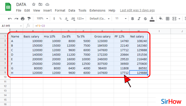
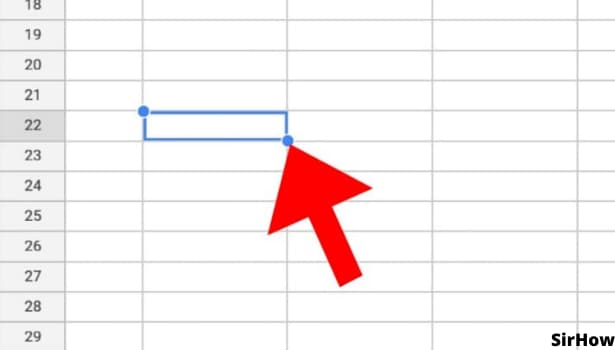
Step-2 Select Your Data: If you have already entered the data in your file, then select the data.
And, if your data is not entered yet, then:
- First, type the mathematical data or information that you want in your pie chart.
- Then, select the data until it gets highlighted. You can also refer to the picture below to see what your sheet should look like when you select your data.
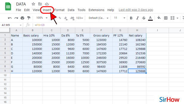
Step-3 Go to the 'Insert' Tab: Now, you have to go to the 'Insert' tab from the top of the menu in your spreadsheet.
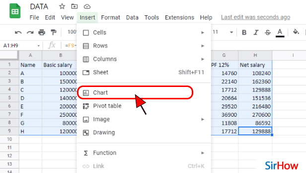
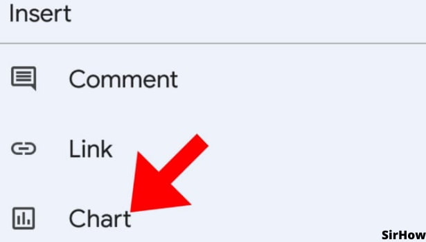
Step-4 Click on 'Chart': In the second section of the list menu of the Insert tab, you will see four options. These 4 options are:
- Chart
- Pivot table
- Image
- Drawing
From these 4 options, you have to choose the second option which says 'Chart' because the pie chart comes under this category only.
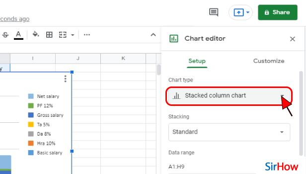
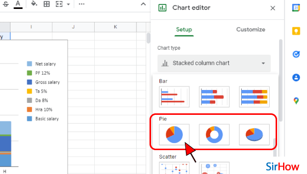
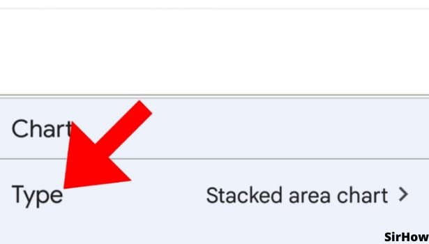
Step-5 Click Here to Select chart type: A chart editor will now open up on your screen along with the chart itself.
Under the title of the 'Chart type', you will then see the default choice as 'Stacked column chart'. You have to click on it to change it.
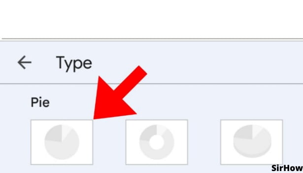
Step-6 Select Pie Chart That You want: Then, different chart options will now appear on your screen. We have to go forward with the pie chart. So, click on the 'Pie chart' option as shown.
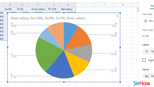
Step-7 Pie chart is Added: Congratulations! You have successfully learned how to add a pie chart for the data in your google sheet.
FAQ
Does Google Sheets Have a pie chart Feature?
As you have already seen in the above article that how you can add a pie chart in google sheets. This obviously indicates that google have a pie chart feature of its own.
You do not have to put much effort in creating the pie chart. Because, you just have to enter your data or statistics and Google sheets will create a pie xhart for tou in a few seconds. You should just know how to insert it correctly. Along with this, you can also insert link in your Google sheet.
How Can I Create a Pie Chart with Categories and Percentages in Google Sheets?
After adding a pie chart to your Google sheets, you have to option to edit it to enhance its overall look and information.
You can also add categories and percentages to your pie chart in google sheets in the following steps:
- Firstly, insert the pie chart into your Google sheets with the help of the above steps.
- Then, click on 'Add Data Labels.
- Then, click on your Pie chart.
- After that, Change to Percentage. It will show the 'Values' of the data labels.
- Then, you have to right-click on the new labels.
- Now, Select the option that says 'Format Data Labels.
- Uncheck the box next to 'Value'.
You will now see percentages and categories in your pie chart.
Can I Insert a pie chart in Google Slides?
Google slides allow its users to insert pie charts in their slides and presentations.
Read the following steps and learn how to do this:
- On your device, you first have to open a document or presentation in the Google Slides app or website.
- Then, you have to click on the 'Insert Chart' option.
- From the 'Sheets' tab, find and click on the spreadsheet with the chart you want to add.
- Then, click on 'Select' to select it.
- Now, simply choose the chart that you want to add. If you don't want the chart linked to the spreadsheet, uncheck 'Link to spreadsheet'.
- Finally, click on 'Import'.
Another method
In school, you would have created pie charts in maths, geometry, or statistics. You can insert a pie chart in Google Sheets as well. Pie charts look like sliced pizza, each having a different topping. Each slice highlights its topping well. Similarly, pie charts slice the whole data according to its proportions and highlight them accordingly with different colors. Adding charts while using Google Sheets is easy and just a matter of some brief steps. Let us take a look at them.
Insert a Pie Chart in Google Sheets in 6 Steps
Step-1 Open Google Sheets: On your mobile device, open google sheets applications. Its icon is easy to spot. It is a green sheet of paper having white outlined cells over it. If you cannot find it, go to the play store application and download it from there.

Step-2 Tap on a Cell: On opening the Google Sheets application, you see a list of all your created or shared sheets. From there select the one for which you want to insert a pie chart in google sheets.
- On opening the desired document, click on any cell.
- If you are sure about where and for what data you want to add a pie chart, select those cells containing the data.
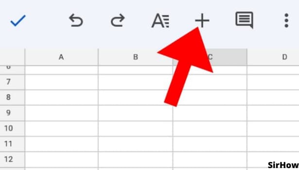
Step-3 Click on '+' Icon: Once you click on a cell, two formatting toolbars open up. One is on the top and the other one is at the bottom.
- In the topmost toolbar, you see an icon of the plus sign.
- It is the icon for inserting different items in google sheets.
Step-4 Click on Chart: After clicking on the '+' icon, a list appears at the bottom of the screen. In that list, the third option is the chart. This gets you near to insert a pie chart in Google Sheets.
Step-5 Choose the Chart Type: Once you select the option of the chart, four different specifications open up. One is of the chart type, the other the legend, and titles and color.
- Firstly, you can select the type of chart you want to insert.
- The option has a small arrow at the right end that looks like a greater than sign >.
- Click on it and you will get further.
Step-6 Select the Pie Chart: By going ahead to the type of charts, you see a list of different types of charts available in google sheets. There is a line graph, area chart, column chart, bar graph, and similarly, a pie chart too.
- Under each type of chart, you see different presentations of it.
- Consequently, select the option of the pie chart and the way you want it to look.
- If the data is not selected, an empty chart is added.
- So make sure you select the data before going through these steps.
Thus, it is easy to insert a pie chart in google sheets. It makes your data easily visible, and you can even analyze it with just one quick view. It looks professional too. When you have to present your data in front of a group, inserting charts in Google Sheets helps a lot. Nobody loves to look at lengthy data sets. Looking at diagrams makes it interesting too. So, try and add a graph to google sheets and see how it looks.