How to Make a Graph in Google Sheets
There might be a need to make a google sheets graph to present your numerical data. The way you can insert an image in Google Sheets, similarly, you can insert a graph. A graph helps in providing a quick outlook of your numerical data. You do not need to go cell by cell and compare the data. Google Sheets will look at the data and make a graph of your choice. Finally, you just have to look at the graph and make your assessment.
How to Make a Graph on Google Sheets
Make a Google Sheets Graph: 6 Steps
Step-1 Open Google Sheets Application: Firstly, open the google sheets application on your device. Its icon is green in color and has white cells over it. You can go to the play store and download it if you do not find it installed on your mobile phone.

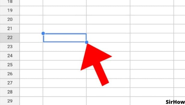
Step-2 Select the Data and Cell: From the list of your shared and personal sheets, open the sheet on which you want to add a graph. In that sheet, see what data you want to represent by a graph.
- Adding a graph works for numeric values so you can add a google sheets graph only if you have such data.
- Select any cell around your data to go further with the process of adding a graph.
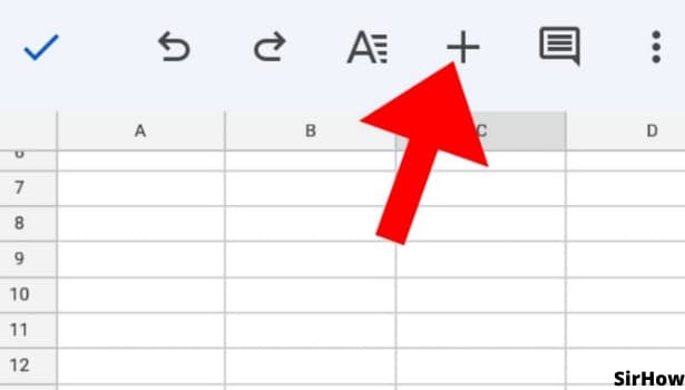
Step-3 Click on the + Icon: After clicking on a cell, a toolbar appears on the top and bottom of the page. On the top toolbar, look for the symbol of a plus sign, '+'. This is your icon to go ahead with.
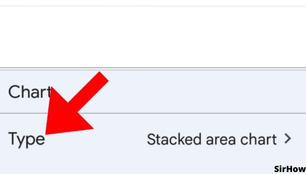
Step-4 Select the Chart Option: The plus sign + option is the insert menu. You see an option of a chart or graph just below the link. It will be third on the list. Click on it and you are subsequently taken to the next array of options.

Step-5 Specify the Details: Now that you have selected the option of the chart, you need to specify certain details. Type, Legend, Titles, and Color can be specified as per requirements.
- Each option has an arrow facing the right side. It looks like a greater than sign. It helps navigate forward and backward from the main list to a specific list.
- Now, first of all, choose the type of chart or graph you want. You can insert a line graph, area chart, column chart, bar graph, pie chart, scatter diagram, or trend chart. Select the type and look of your graph from the Type menu and go back with the back arrow key on the top left.
- Next is Legend. It is the specification of the chart and what it represents. You can choose on which side you want the information. Right, Left, Top, or Bottom.
Step-6 Finish the Details: Two more details can be specified after Type and Legend. That is titles and color. You can modify the title of the chart, its axis, the name of segments for a pie chart, and alike.
- Use the color option to change the default colors of the chart.
- You can use your brand colors or any specific set of colors. As a result, your google sheets look uniform.
.jpg)
Finally, your chart is added. You can adjust its placing and size just like you adjust an image in google sheets. For what purposes can you add a chart or graph? Well, for instance, your google sheets have monthly cost and expenditure data. You can create a separate graph for them and see the trend throughout the year in one glance.
- It is also useful when you have data on students' marks. Their performance can be seen and assessed with the help of a graph.
- You can also merge cells in Google Sheets and place the chart over the enlarged area.
- Thus, it will not overlap over other data and will be visible clearly.